Amtrak Fare Comparison Feature Case Study
Amtrak's Original Design

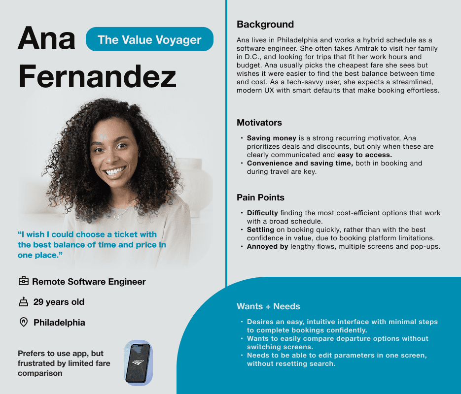
My Final Design

The Problem
Amtrak serves 34 million riders a year, but its mobile app lacks the flexible search and booking patterns people are used to from modern travel platforms like Google Flights and Kayak. I hypothesized that price‑sensitive riders in particular struggle with the existing booking flow because fares are hidden behind repetitive, date‑by‑date searches, making it hard to feel confident they’ve found a good deal.
Research → Insight
5 rider interviews + 14-person survey revealed:
No round-trip price visibility → constant back-and-forth
Users expect calendar exploration, not linear probing
Competitive tools (Kayak, Google Flights) let you browse before committing
I ran a survey with 19 diverse users and five in‑depth interviews with frequent Amtrak users. Across both, one theme was clear: people wanted to see options, specifically fares, at a glance without leaving the existing flow.
The current date picker hides fares behind repeated searches. This caused flexible riders to change dates over and over, never sure they’ve found the best deal. Most interviewees sorted by price first and only then checked if the times were “good enough,” showing that quickly spotting a great fare mattered more than fine‑tuning departure times, or train type.
For Amtrak, that behavior is an opportunity: making low fares easier to discover can keep riders from dropping off mid‑search and help more of them complete bookings they feel good about
The Core Solution
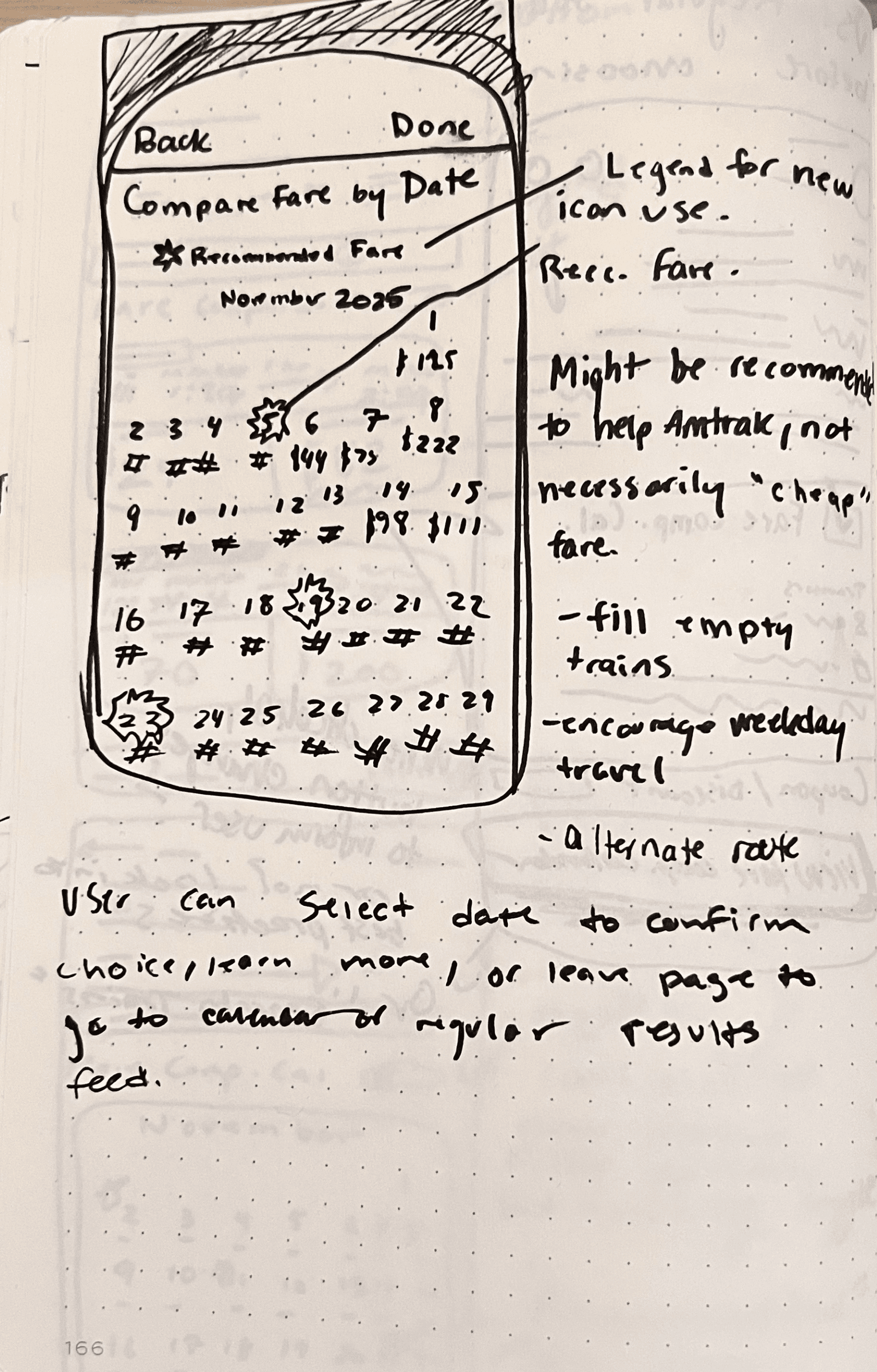
Decision 1: Embed fares in the date picker
Instead of sending riders to a separate “deal finder,” each calendar day displays its lowest available fare. Flexible riders can scan the month, pick budget‑friendly dates, and move on without repetitive searching.
Decision 2: Replace “recommended fares” with transparent pricing
I explored a version that highlighted “recommended” fares with a special icon, but peer feedback showed a preference for straightforward, transparent prices over algorithmic suggestions. I dropped the recommendation layer and focused on clear, comparable fare information instead.
Design

Back
Done
Compare Fares by Date
November 2025
S
M
T
W
T
F
S
1
$95
2
$102
3
$86
4
$74
5
$63
7
$101
8
$104
9
$85
10
$65
11
$59
13
$73
14
$116
15
$100
16
$87
17
$86
18
$47
19
$55
20
$65
21
$104
22
$104
23
$105
24
$81
26
$70
27
$75
28
$98
29
$106
30
$92
6
$78
12
$62
25
$88
December 2025
S
M
T
W
T
F
S
1
$77
2
$61
3
$56
4
$79
5
$111
6
$100
7
$89
8
$81
9
$74
10
$58
11
$84
12
$84
13
$116
14
$99
15
$65
16
$69
17
$66
18
$66
19
$103
20
$95
21
$97
22
$80
23
$65
24
$60
25
$64
26
$116
27
$125
28
$88
29
$84
30
$63
31
$55
Design Evolution
I started with quick sketches to explore how much fare information could fit in each calendar day without overwhelming the view. Those became low‑fidelity wireframes for three key states: monthly overview, selecting outbound/return dates, and a summary with total price.
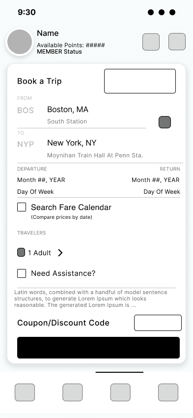
After validating the flow, I rebuilt the screens in high‑fidelity Figma, reverse‑engineering Amtrak’s existing components so the new calendar felt native while giving fares clearer hierarchy and contrast.
Constraint: No Amtrak design system access. I used Figma plugins to recreate brand patterns pixel-perfect.
Date selection with responsive low price details
Back
Done
Compare Fares by Date
MON, 8TH DEC
SAT, 13TH DEC
December 2025
S
M
T
W
T
F
S
1
$95
1
$95
2
$95
3
$35
4
$65
5
$45
6
$107
7
$202
8
$29
9
$38
10
$178
11
$112
12
$150
13
$55
14
$112
15
$142
16
$142
17
$113
18
$113
19
$91
20
$272
21
$150
22
$72
23
$72
24
$72
25
$25
26
$91
27
$112
28
$112
29
$72
30
$45
31
$25
30
$35
31
$78
1
$95
Calendar Screen Close-up
Test & Results
8 Amtrak riders → round-trip booking task (flexible low-fare dates):
Feedback emphasized the calendar’s native feel and confidence-building visual fare display. Iterations polished filter/sort options, fine-tuned consistency, and aligned screens with close-to-exact Amtrak’s design system. The clickable prototype, built in Figma, showcased final iteration—offering extensive price visibility with seamless fit into the booking workflow.


Conclusion
This project confirmed that Amtrak users need a more intuitive and flexible booking experience—moving beyond a basic, rigid point-to-point app toward a design aligned with broader travel industry standards. Key challenges included limited real knowledge of Amtrak’s product, lack of stakeholder access, and scarce official design assets, which required adapting brand elements creatively.
I learned the importance of basing design decisions on user research and being adaptable under constraints. For future work, earlier usability testing and stakeholder involvement would improve outcomes.
This experience demonstrated that even a small scope of focused feature enhancements can meaningfully improve usability. I’m proud to have independently led the project end-to-end, delivering a solution that enhances user confidence and control. Next steps include comparative usability testing against the current app to validate these improvements further.


